See where your store loses customers
We walk your purchase path on mobile — from the homepage to checkout — and show what's costing you conversions. Free, in a few minutes.
The whole purchase path, step by step
First screen
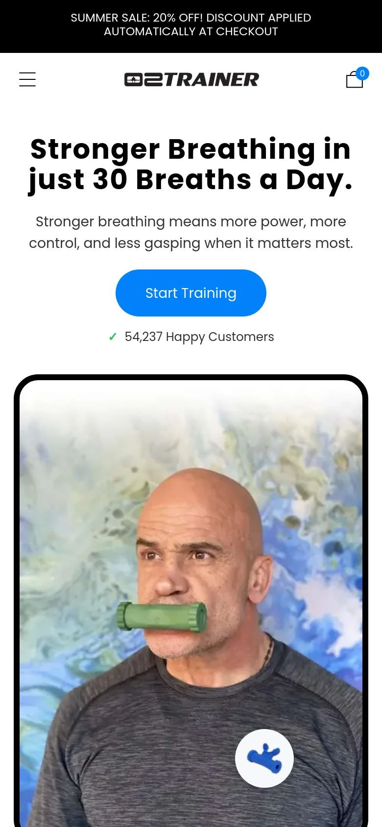
A few seconds decide whether a visitor from an ad stays. We check whether it’s instantly clear what you sell and where to click — and what’s covering your products: banners, countdowns, popups.
Product page
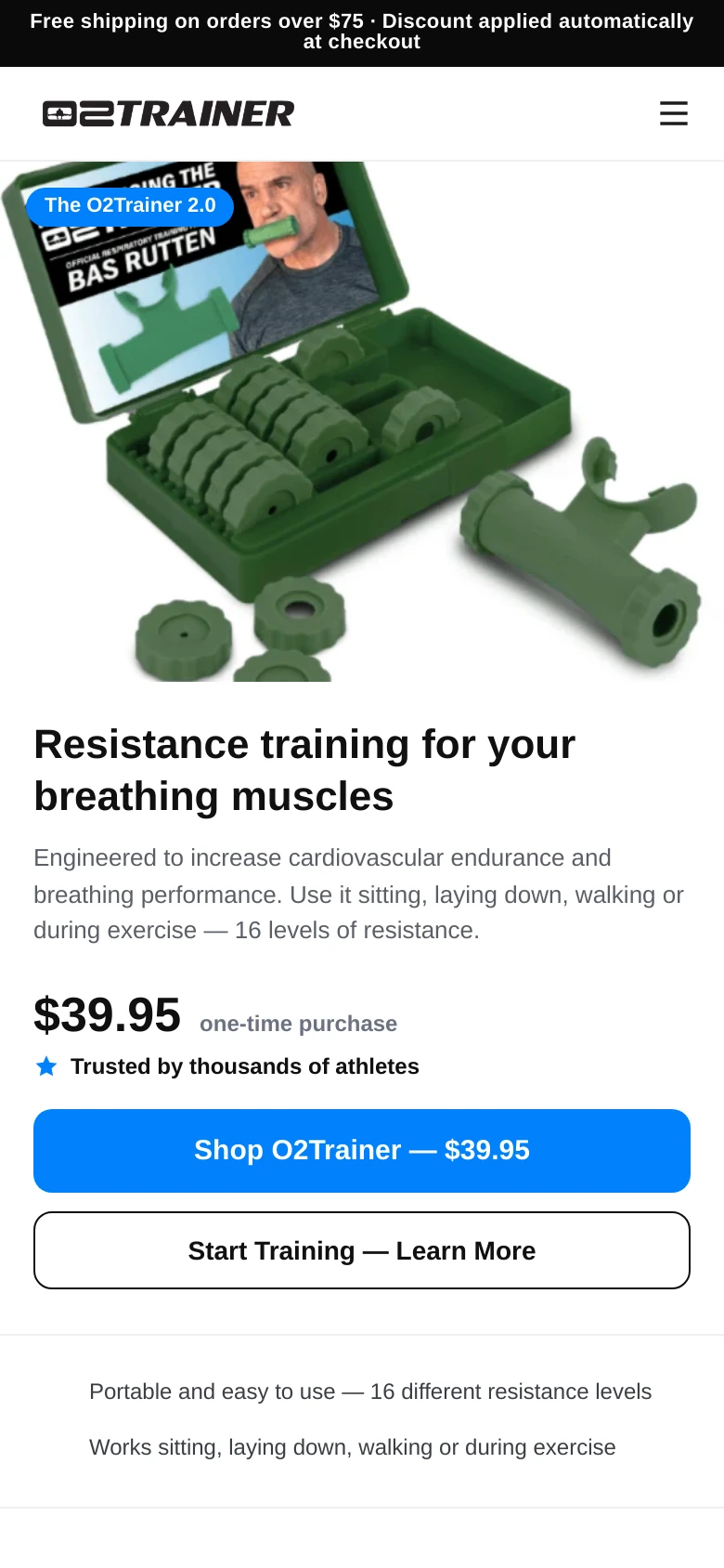
Where the purchase decision happens. We assess photos and gallery, price presentation, bundles and upsells, CTA hierarchy and social proof next to the buy button.
Cart & drawer
The last chance to lift order value without pushing the customer. We look at the free-shipping bar, threshold-closing products, line-item clarity and the coupon field.
Checkout
Where most orders are lost. We check guest checkout, field order, the number of required inputs and the full set of shipping and payment methods.
Scan, findings, mockups
We scan the path
We walk your store on a phone like a customer from your market: homepage, category, add to cart, checkout. Every view yields screenshots and hard metrics.
We weigh findings
Every finding comes with evidence from the scan, and every claimed “missing” is re-verified on the full page. Only what’s confirmed makes the report. Our recommendations draw on Baymard Institute and Nielsen Norman Group research and Zest’s own practice.
We show the fixes
You get the key views redesigned — mockups built on your store’s logo, photos and prices, with a before/after slider.
Check your cookie consent with our free Consent Mode Checker.
Conversion leaks in the funnel
That’s how many orders vanish between add-to-cart and payment on average (Baymard Institute). Most causes are friction you can remove.
Customers mostly look at what they see without scrolling — and three quarters of attention ends within two screens (Nielsen Norman Group). What you show first decides the rest of the visit.
Purchase-path fixes lift conversion from the traffic you already have — before you add a single dollar to media.
How it differs from a classic UX audit
A classic expert audit is researcher's work: walking the site against heuristics, analysing GA4 and heatmap data, often user testing — and a report in two to six weeks. Our tool does one thing, but on the spot: it walks your store's purchase path on a phone like a customer and shows findings with evidence plus “after the fixes” mockups — in a few minutes, for free.
The tool works with what it sees on the path. Your analytics, customer conversations and operational context stay outside the scan, so wherever that context matters, the recommendation is conditional. Treat it as a first step: a fast diagnosis of friction on the path. When you want to go deeper — with research, analytics and strategy — that's what a full audit with the Zest team is for.
This is what the audit result looks like
A verdict in plain words, a score for each of the six purchase-path areas, findings pinned to screenshots of your store — each with evidence from the scan and a recommendation. The full version also includes “after the fixes” mockups built on your store's logo, photos and prices.
UX audit — what you need to know
A UX audit is the fastest way to find out why a store gets traffic but sales don't grow. We've gathered in one place what it is, what it covers, which methods are used and how to do one yourself — and if you'd rather take the shortcut, enter your store address at the top of the page and see the result in a few minutes.
What a UX audit is
A UX audit is a systematic assessment of a site or store from the user-experience angle: where the road to the goal — in e-commerce, to a purchase — is longer, less clear or more tiring than it should be. A good audit sticks to facts. Every finding has evidence (a screenshot, a metric, a recording), points to the cause rather than the symptom, and ends with a prioritised recommendation: what to fix first for the biggest effect.
The result of an audit is a map of friction. Friction is everything that stands between the customer and the purchase: a banner covering the products, a button you have to hunt for, a form with fields no one needs. Removing friction lifts sales from traffic you've already paid for.
What an online store UX audit covers
In e-commerce you audit the whole purchase path, not individual pages — because customers drop off at the seams between steps, not inside one. The canon looks like this:
The first screen of the homepage — this carries the most weight: 57% of viewing time falls above the fold, and three quarters within the first two screens (Nielsen Norman Group). In our practice what matters is whether it's immediately clear what you sell, for whom, and where to click.
Navigation and listing — whether a customer who didn't click the bestseller finds what they came for: categories, search, filtering, readable product cards with prices.
The product page — the point of decision: photos and gallery, price presentation, bundles and upsell, one clear buy button, social proof.
Cart and drawer — the last chance to raise order value without pressure: a free-shipping bar, products that close the threshold, readable line items.
Checkout — this is where the most is lost: on average about 70% of carts don't end in a purchase (Baymard Institute, an average of 50 studies). Reasons named by abandoning shoppers include shipping costs shown too late, forced account creation and forms that are too long.
Plus, cutting across it all: trust (policies, contact, payment security) and the mobile version — because in most stores the phone is the first screen of contact with the brand. The same rules apply to service pages — only the goal of the path changes: a lead or a sign-up instead of a purchase.
Which methods are used for a UX audit
In practice you'll meet four approaches, usually combined:
Heuristic evaluation — an expert assesses the site against proven design principles, most often Nielsen's ten usability heuristics (Nielsen Norman Group) and — in e-commerce — guidelines from Baymard Institute research. Fast and cheap, but the quality depends on the auditor's experience.
Data analysis — GA4, heatmaps, session recordings: where users actually drop off and what they click. It shows the scale of problems, less often their cause.
Usability testing — observing real users performing tasks. Closest to the truth, but the most expensive and slowest.
Cognitive walkthrough — going through the path step by step with the eyes of a new user, asking “do I know what to do next?” on every screen.
Our tool combines the cognitive walkthrough with heuristic evaluation and hard metrics from a real browser: it walks the path like a customer, measures what's visible without scrolling, and confronts every finding with the full page screenshot. It leaves analytics and user testing to experts — those need access and time.
When a UX audit is worth doing
Four moments when an audit pays back fastest: when traffic is there but conversion is flat or falling; before an ad campaign — because you pay for every user who falls into a leaky funnel; after a redesign or platform migration — because “new” always means “untested”; and periodically, even when nothing has changed. A store is alive: promotions, popups, new widgets and plugins can quietly break a path no one has walked end to end in months.
How to run a UX audit yourself
You can do a basic diagnosis in an hour. Open your store on a phone, in incognito, and walk it like a customer coming from an ad:
First screen: within a few seconds, is it clear what you sell and where to click? What covers the products — a banner, a timer, a popup?
Category and product page: are the price and the buy button visible without long scrolling? Do the photos show the product, and are reviews where the decision is made?
Add to cart: do you get clear confirmation and a sensible next-step suggestion?
Checkout: can you buy without creating an account? How many fields do you really have to fill in? Are all delivery and payment methods readable?
Along the way, count every moment of hesitation and every obstacle — those are your findings. At the end, prioritise them by a single criterion: what gets in the way of buying the most. This method has one limitation: you know your own store too well to see it with fresh eyes. That's why we built the tool: enter your address at the top of the page and it will walk the path for you and show the result with evidence.
The most common store UX mistakes — what we see in scans
Every item on this list is a finding from audits run with our tool:
False urgency: a promo timer that resets or stands still. Customers spot it faster than you'd think — and stop trusting your real promotions too.
A welcome popup demanding a phone number in exchange for a discount or a freebie — an entry barrier that discourages sign-ups instead of encouraging them.
An “Add to cart” button only after one and a half to two screens of scrolling, even though the price is visible right away.
Stacked bars above the content — a promo bar, a phone bar, a shipping bar — which together push the products off the first screen.
A struck-through price on a dozen cards in a row: when everything is on sale, the sale stops being an argument.
Seven delivery methods listed one under another, ungrouped — the customer has to compare near-identical options on the final stretch.
A prominent coupon field at checkout — an invitation to leave the store hunting for a code (Baymard calls it “coupon hunting”).
Bundle photos that don't show their contents — the thumbnail says something different from the name and price.
If even one point sounds familiar, the audit will show whether it occurs on your store — and exactly what to do about it.
How long a UX audit takes and what it costs
An expert audit on the Polish market runs from a few hundred złoty for a basic review of a single path to tens of thousands for full scope with analytics and user research; delivery usually takes two to six weeks. It's a good investment — provided you know what you need.
Our tool is free and ready in a few minutes, so the natural order is simple: first a fast diagnosis, then a decision with data in hand. If the scan surfaces problems that reach beyond the purchase path — that's when a conversation about a full audit makes sense, with a concrete starting point.
What comes after the audit
The real work starts after the report. Begin with the critical findings on the first screen and at checkout — that's where the leverage is greatest. Ship fixes in batches and measure the effect in GA4 across the individual funnel steps: from entry to the product page, from cart to purchase. After bigger changes, repeat the audit — it's the fastest way to check whether the fixes worked and nothing new broke the path. The “after the fixes” mockups from the full report shorten the road from recommendation to implementation: the team sees the goal, not just a description of the problem.
Frequently asked questions
Is the audit free?+
Yes. You see the short version right on the page, and you unlock the full report — every finding plus the mockups — with a link sent to your email. No strings attached.
How long does it take?+
Walking the path and analysing it takes two to five minutes — a small store finishes in about two and a half, a large one in close to five. The before/after mockups appear 2–3 minutes after you unlock the full version.
Which stores are supported?+
Online stores — any market. The report is written in the language of the page you order it from: Polish from the Polish version, English from the English one. We walk stores on WooCommerce, Shopify, Shoper, IdoSell, PrestaShop, Magento and custom engines. We do not score the Shopify checkout: it is the same for every merchant, so any remark would land on Shopify, not on the store. When a step cannot be walked, the report says so.
We'll implement the audit's fixes
Book a free 30-minute results walkthrough — we'll go through the report point by point and decide what to fix first. We reply within 24h.
Book a walkthrough